Dutch Bros

My Process
Overview:
My colleges Sunny Collins and Cynthia Gurrola and I were tasked to conduct UX/UI testing for the Dutch Bros website. With the data gathered from our team effort of conducting User Research and Personas, Heuristic Evaluation, Usability Testing Materials, Usability Testing, Data Analysis and Findings, and Site Comps and Design Explanation, we came up with solution for Dutch Bros to enhance their user experience on their website and created a mock-up with the solution we came up with based on our research.
Table of Contents:
- Executive Summery
- Introduction
- Methodology
- Results
- Recommendations
- Conclusion
Executive Summary:
For our research, we wanted to test to see if the user could do simple tasks that a normal user would be doing without any hassle and if we could improve that experience further if possible. So we had 3 scenarios that had 2-3 tasks that could help us test the functionality and user experience with the website and things to improve.
Scenario 1
Tasked the user to find a product, create an account, and checkout.
- The purpose was to see if the user can browse and navigate through the website to find what they are looking for, create an account, and order without any hassle.
- With this scenario, we found out some problems the users ran into and some potential problems future users could run into. We already had an idea of some and also know where to focus on for more now.
Scenario 2
Tasked the user to find a drink through the menu and find a location or hours of a store to order the drink from.
-The purpose was to see if the user can navigate through the menu, find their preferred drink, and find location info for a store nearby without any hassle.
-We learned from this scenario that the site has some errors that we were unaware of and that the shop menu popping up in a new window on a different site is very disruptive to the user experience and the options were either overwhelming or not enough.
Scenario 3
Tasked the user to find the company's social media and check it out.
-The purpose was to see if users wanted to interact with the company or stay updated that they could find the relevant social media to do so from the website
-The users who were interested in social media found their content to be pleasing and relevant and easily found their way to their desired social media.
Introduction:
So we as a team had an idea about some of the problems and usability issues or concerns that we ran into when testing the site ourselves. We created scenarios and tasks that put the user in our and any everyday users’ shoes and took them for a ride through the site to see what kind of errors, problems, suggestions, and feedback we could uncover. We found out so much more with the 6 participants we gathered. Each user went through 3 scenarios and 2-3 tasks each. The user also filled out a pre and post-test questionnaire in which we gathered more data about the experience and knowledge of the site. From the pre-test, we gathered knowledge of our demographics, from the scenarios we got a better understanding of our user’s needs, bugs, and potential issues in the future, and from the post-test we understood how the user felt and experience the website. Based on the questionnaire we knew we were headed the right way as the data shows a compelling reason why and now we know what all we need to work on.
Methodology:
For our research, we wanted to test to see if the user could do simple tasks that a normal user would be doing without any hassle and if we could improve that experience further if possible. So we had 3 scenarios that had 2-3 tasks that could help us test the functionality and user experience with the website and things to improve.
Participants
We had a total of 6 participants in our study.
Objective:
Participants were tested on the current effectiveness and experience of using the Dutch Bros website with scenarios and tasks related to the commonly clicked-on areas of the site.
Data Collected:
We collected Pre and Post Test Questionnaires from each participant. In addition, while participants are completed each task, we observed and recorded whether a task is completed, how long it took, the path taken to complete it, errors, written observations, and any out-loud comments/quotes.
Our Criteria
Pre-Test Questionnaire
Consisted of demographic, computer skill, and website usage questions. We wanted to have an idea of the online and personal habits of our participants through these questions so we could better interpret the outcome of the test. So using the word “frequently” or asking “how often” was used to determine behavior.
Post-Test Questionnaire
Aimed to determine browsing comfortability and overall ease of using the site. Some questions were aimed at specific tasks participants were asked to complete. We took the suggestion from the lecture to ask participants in three words to describe a certain situation to get to the point of the problem.
Scenarios & Tasks
Designed to highlight the areas of the site we felt would be high traffic and prone to user confusion. We wanted to give tasks that gave us direct information from the user on how to better design the areas we felt were lacking in one way or another.
Data Analysis
Our findings were based mostly on the Qualitative data found from participant’s out-loud and post-questionnaire comments. Quantitative data found from some of the answers in the post-questionnaire using Google Forms was also a huge help in seeing the statistics visually.
Results:
1. Error with Private Reserve Link on Scenario 1 Task 1
- Scenario 1: You are a stay-at-home parent and are busy taking care of the household. You noticed you’re about to run out of coffee and wanted to order coffee online to brew yourself to help you and your partner start your busy life. Task 1: Find the product you are looking for.
2. Dutch Bros Site needs desktop & mobile re-design
- Post-Test Questions/Answers showed us that users were having a unsatisfying mobile experience on their desktop.
3. Dutch Bros site is separate from the Dutch Bros shop
- Various Scenarios and Tasks showed us the flaw in differentiating the main Dutch Bros site to the Dutch Bros shop.
4. Usability functions are not uniform across the site
- Post-Test Questions/Answers brought to light the lack of uniformity and fluidity of links, cursors changing, and endless pages.
5. The menu does not provide descriptions, prices, ordering, or nutritional facts
- Tasks and Pre/Post-Test Questions/Answers and Tasks showed that users not only view the menu for options but additional information that was not available.
Recommendations
Issues
- Error on link when attempting to access the Private Reserve Blend
- There is no desktop version of the website when accessing website through a desktop/laptop, a mobile version of the site is provided when doing so
- The Dutch Bros site is separate from the Dutch Bros shop
- The Dutch Bros site is separate from the Dutch Bros shop
- Menu does not provide descriptions, prices, ordering, or nutritional facts
Supporting Material
- 33% of participants encountered this issue
- Participants have mentioned “too much white space” or having to scroll too far down to access material. This is due to the different screen sizes -- vertical/horizontal alignment.
- Per observations, this has thrown off some participants since it leads user to a new tab. User is then unable to click the “previous page button” and must close tab in order to proceed to Dutch Bros homepage
- Participants stated that site “lacks fluidity” due to having to randomly click images since the cursor does not always change into a hand cursor when an item is clickable
- Pre-Test, Post-Test, and comments from Scenario 2 Task 2 gave overwhelming evidence that this is lacking from the user experience.
Recommendations
- Provide a link that is compatible / working
- Provide a desktop version of the site for users that access the site through a desktop/laptop. This will also adjust the hamburger navigation bar to something more appropriate for the desktop version since the hamburger navigation is a mobile version feature.
- Link the Dutch Bros site and Dutch Bros Shop site, that way it does not open a new tab when selected
- Make it apparent that links are clickable and adjust hand cursor
- Design a place where descriptions, prices and nutritional facts can aesthetically be on the same drink page. Also, design a ordering system for people to place mobile orders since that is in high demand.
Conclusion:
Concluding our research, we collected a list of improvements that would enhance user experience. Our findings ranged from technical errors to simply user convenience such as consistent usability functions, fixing broken links, linking sites and providing a desktop version of the site. The usability test helped us determine the hierarchy needs of the users and provided us with different point of views of those accessing the site. The data collected was consisted of users from different demographics all while given different scenarios/tasks. Overall, this provided a foundation that will help complete the needs and wants for a successful site.
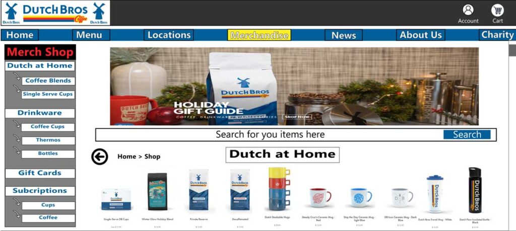
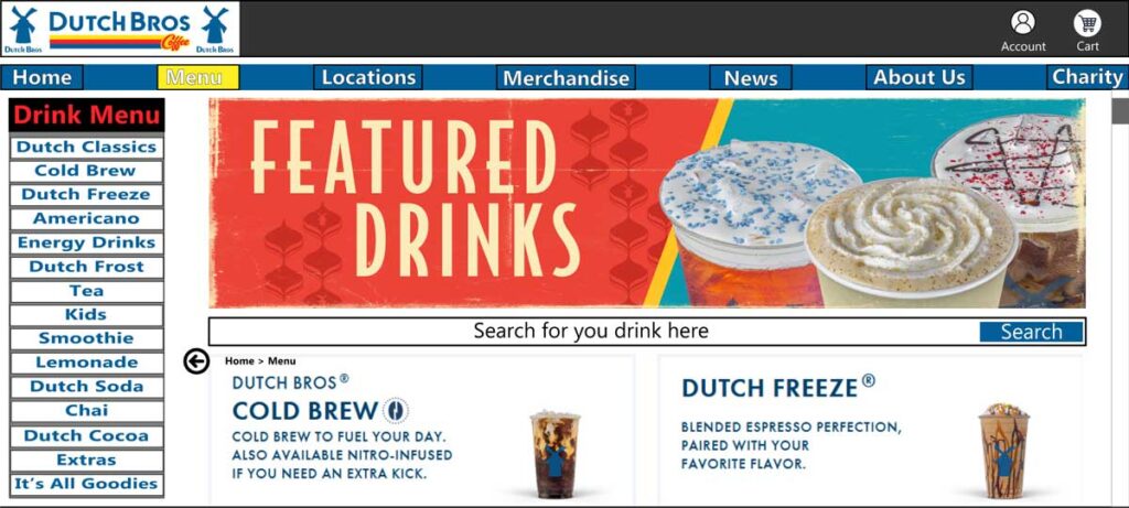
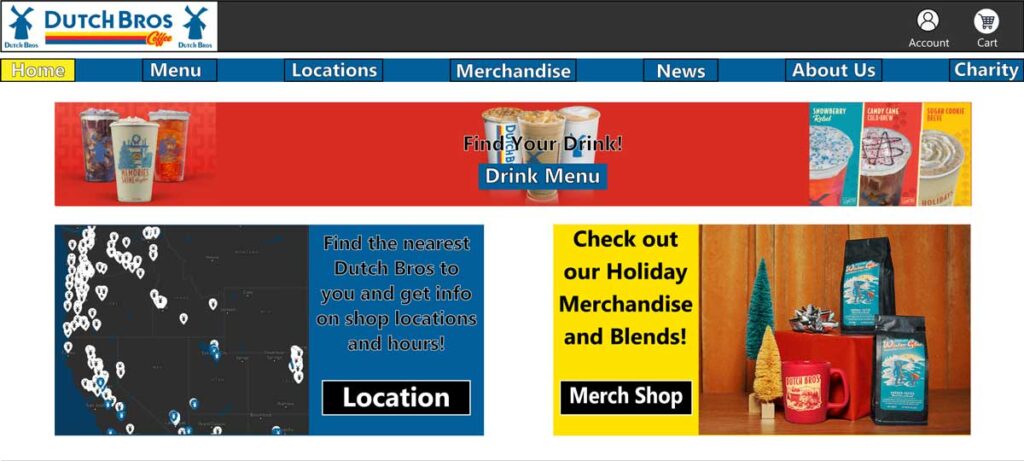
Design Explaination:
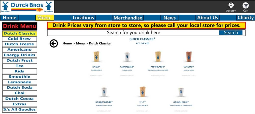
So, when I was designing the mockups for this project, I knew I wanted to simplify and better organize some things like the menu, shop, and just make the site pop out more with colors. The first thing I knew I was going to do was to make horizontal navigation bar. The participants in our research noted to me that they did not like the mobile style side navigation. I also changed the navigation options. I took out the coffee navigation because it seemed redundant when there is drinks menu and merch shop menu navigation link. Next, I added buttons anywhere where there might be a link. Some of our participants did not know that the images in the site were clickable and linked them to a desired page so I thought adding buttons where applicable would be a good change. The next thing I did was in the menu page. I added a vertical menu so the options can be more condensed and easier to see the menu as a whole. Some of our participants were overwhelmed by the options and some thought they need more options and talked about a lot of scrolling. So, I did not change all the options, but I added better navigation so one could find there drink better by adding a more prominent search bar, the vertical menu acting as filter and a back button and page hierarchy list to show where the user is. Some of our users did not even notice the search bar or it took them some time to figure out that there was a search bar, because the sites search bar was looked camouflaged with the background. So I gave the search bar a border and made it stand out more. Inside the drink’s menu, I added a notice letting users know that the prices vary from store to store so they won’t find any prices on drinks in the site, but they can call the local shop to get info on that. I did this because a lot of our participants did not like that there was no prices listed and some mentioned how they were less inclined to get coffee if they did not have prices. I also kept the other additions in there as well like the search bar, back button, and vertical navigation drink menu. I added breadcrumbs so users keep in track of where they are. Lastly, I made it to where the merch shop is part of the main site and not in a pop-up to a separate site. The new merch shop page also includes a vertical merch menu, search bar, back button, and page hierarchy breadcrumbs.
