Bagwell

Bagwell Center for Media and Art
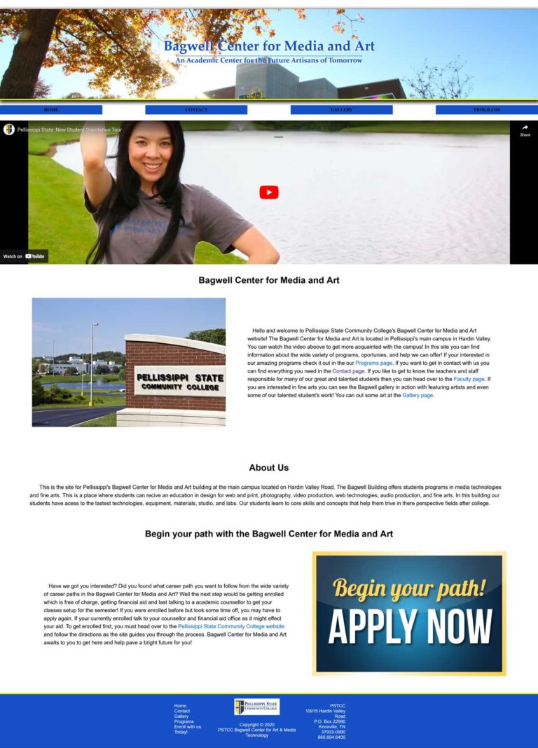
Pellissippi State Community College tasked me to create a website for their Bagwell Center for Media and Art building. This is the building where creative students of Audio & Video production, Design for Web & Print and Web Technologies, Photography, and Fine Arts majors come to study build their path to their careers. I was provided with some content to work with and was allowed to pull content they generated from their official channels of media.
Process:
I started out my process by first accessing what pages needed to be their and what could fit in with other pages. Eventually I decided on the site map and hierarchy of the webpages. I decided that their would be four navigation links on the nav menu. They would be Home, Contact, Gallery, and Programs. The programs page highlights each of the six disciplines and has each of the six programs as a separate sub-menu.
Next I started to plan out what kind content I would have in these webpages. So I thought being a creative arts building, the website should have a lot of media incorporated throughout the site, it should be visually appealing and staying close to the school colors and branding, and it should be designed for a wide age range since its a community college and the students come in a wide variety of ages. So content should be very legible, easy to follow for new students, and straight to the point so new students can see what these programs have to offer quickly and easily.
So I gathered as much media I could find and see what and where I could put them to use. I tried to have a video in all pages and planned out which page I could use other materials like photos and text and made sure to focus the experience for new students or student unfamiliar with the building since they would gain the most value from visiting the site to learn about what the Bagwell building has to offer.
After I figured out where I wanted to place my content I started making wire-frames and then drew up some mock-ups after I was satisfied. Then I started to create the responsive website for desktop, tablet, and mobile view-ports using HTML and CSS. I started designing from desktop view-port size and then I create media queries at 1100px and 550px as instructed. I used flexbox and grid to help me design a responsive web design. In the end I created this..
Website Viewports
Desktop

Tablet View-ports

Mobile View-ports

